 |
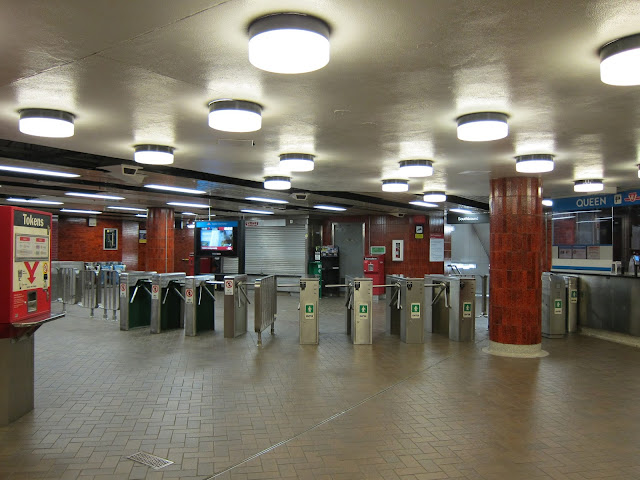
| The funky overhead lamps in the Albert Street mezzanine: like an enchanted field of glowing ceiling mushrooms. |
Second, following the fresh example of the Spadina line stations, a sizable and dominating work of art was commissioned for the station’s platform walls.
Consisting of four 50-foot-long, hand-painted, porcelain-on-steel-panel murals (repeated twice for each platform), Our Knell by John B. Boyle was paid for by Eaton’s, Cadillac Fairview, and Simpson’s, with assistance from Wintario. Boyle’s work beat out competing submissions from Gerald Zeldin (who did Summertime Streetcar at Eglinton West) and Ken Danby.
 |
| A chunk of Our Knell, viewed from the opposite platform |
The murals depict: Nellie McClung, women’s rights crusader—one of the Valiant Five who successfully petitioned to have women recognized as “persons” by the Dominion government in 1927; and William Lyon Mackenzie, Toronto’s first Mayor and leader of the 1837 Upper Canada Rebellion. The social democrat and founder of the CCF, J.S. Woodsworth, was originally supposed to be McClung’s partner on the murals, but he was ditched by the staid sponsoring committee in favour of Mackenzie. The murals also depict the new City Hall, the Eaton Centre, and Simpson’s.
The title of the piece plays subversively on the affectionate title (‘Our Nell’) given to McClung by her followers; it is intended to sound a cautionary note to the optimism of the piece.
Getting back to the station modifications, the bold red and blue bands on the platform ceiling were added, to create a strong optical sense of movement, a flourish not seen elsewhere in the system.
 |
| Peering down the platform at Queen station |
Subsequent to this, ceramic tiling replaced the original pale grey glass platform wall surfaces (though a few of the Vitrolite tiles still persist at the northern-end stairwells). This was part of a much-maligned refreshment program of the original Yonge line stations; the Vitrolite aesthetic had fallen out of fashion and many station tiles had broken or cracked over decades of usage. Some of the Queen tiles wound up salvaged for repair use at Eglinton, which shared the same colour.
Notably in the case of Queen, the primary station identification typeface no longer matched that found on the strap-line, which retained the blue tiling.
 |
| Compare those Q tails! Some flavour of Helvetica below; the TTC subway typeface (subsequently called Bloor-Yonge) on the top. |
Other alterations to Queen include:
- the replacement of the initial street entrance stairwell on the north-east corner of Queen and Yonge, with an interior entrance via the old Bank of Montreal building (the old stairwell and entry space still exist, unused today, covered by a grille—see the archival section in the gallery for some snapshots of this space);
- the construction of the south-west corner stairwell for Simpson’s; and
- the expansion of the second passenger corridor beneath the subway platform, to accommodate elevator access between the north and southbound platforms. This widened walkway cannibalized part of the empty shell of the Queen Lower space beneath the station.
Happily, you can still find an overlooked smidgeon of the station that has been retained from its long history: a pair of overhead Northbound and Southbound platform signs, which may possibly be extant from 1954.
 |
| You are heading southbound. |
I hope the TTC keeps them in place!
Queen station is named, like the street, in honour of Queen Victoria. Prior to 1837 the street was called Lot as it served as the baseline for York’s park lots, but Victoria’s ascension to the British throne gave our municipal mandarins sufficient impetus for a renaming.
Queen Lower
Yes, it’s true. When the TTC built Queen station, they also constructed beneath it, the roughed-in shell of a connecting streetcar platform for a Queen ‘subway’.
As I did with Bay Lower, I’ve diverted my ruminations on Queen Lower into a separate entry.
Photo Gallery
Tour the station, and view captioned historical images from its past:
Transfer:
More about Queen
TTC Station info | Map | Wikipedia: Queen
My next stop: Queen Lower
Previous station: St. George
Alphabetical Station Selector


