Oh, the madness of St. George!
Imagine if every member of Toronto’s city council was forced to experience—even once—the terrifying crush of St. George during a rush-hour system delay. Their stingy attitudes about funding our overloaded transit network would change in a hurry.
 |
| St. George upper platform: It’s almost never this empty. |
 |
| A reminder of the original system intent for St. George |
On February 28, 1963, St. George entered service as the northern
terminal station for the newly opened University segment of the
‘Bloor-Danforth-University Subway’. That historical name for the
line—appearing on the commemorative plaque displayed in the
mezzanine—hints at the original operational design for St. George. It is
a vital clue in understanding why the station is so often crammed well past
the threshold of comfort.
You see, we don’t use St. George in the way its designers envisioned.
The capacity and circulation requirements at St. George were thus understood as much lower. But a rocky 6-month interlining trial period (starting February 26, 1966) led a
conflicted TTC management to eventually opt for separated line operations, with St. George again becoming the terminal for the University line, after Labour Day of that year. The predictable effect on St. George was immediate: unwieldy crowds built up during the afternoon rush hour, due to people physically transferring between the lines.
Yes, it has been this way since 1966. And we knew it would happen.
But we did—and voilà, we have the St. George of today. When four trains unload on both platforms simultaneously, it’s an instant overload. And if there’s a delayed train? Oof! Whether you frame it as a cruel deficiency of Wilson’s integrated design, or as a series of perverse historical choices to use the station in a different way than intended, or both, it doesn’t really matter: St. George is barely adequate for the task we have currently set for it. And of course, we kept pushing off the Relief line, decade after decade.
 |
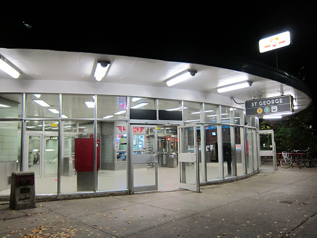
| The St. George St. George Street entrance. Say that ten times fast! Look at that swooping canopy. I wish we had more of these. |
In 1994, the prototype for a novel wayfinding scheme designed by pictogram authority Paul Arthur was installed as an experiment at the station. A dragon icon was chosen to symbolize St. George, and could be found beside the station name on the strap-line along half the platform (on both levels), and on the Bedford Road entrance pylon sign. However, the funds for implementing the new wayfinding project system-wide were not ultimately approved, and the Arthur design never proceeded any further. You’ll need to peek into the archival section of the gallery to see examples: the prototype signage and iconography at St. George was mostly removed in 2015 (though the Bedford Road pylon survived in place until roughly 2020).
In terms of remaining decorative elements, in addition to the aforementioned commemorative plaque, a pair of ‘Then and Now’ photos decorate the space by the Bedford Road collector booth. Curiously the photos are of the south east corner of Bloor St. and Queen’s Park Road, which is a lot closer to Museum if you ask me.
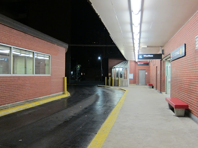
Should you need to escape from the milling crowds of humanity for a few moments, the bus platform up at street level usually offers a relatively quiet spot for repose.
 |
| The 26 Dupont bus platform at St. George. |
 |
| The OISE basement portal: One of the harder-to-find subway entrances, from street level. |
St. George is named after Laurent Quetton, a French royalist who fled the French Revolution and arrived in England on St. George’s Day. Quetton added St. George to his name, and later became a businessman in Upper Canada, building the first brick home in York. His friend William Baldwin (who had designed the house) named St. George Street after Quetton when the area around Spadina Avenue was developed.
* “If you do that, you will find you have wrecked the Bloor Subway.” Wilson, as quoted in the Globe and Mail editorial of August 4, 1972. He favoured a Christie connection for the Spadina line, but obviously that did not materialize. I know the repeated invocation of interlining has been ponderous, but it is amazing how the bungling of integration permanently rippled through to affect the present-day network. I may never truly love St. George station—but having learned this aspect of its snarled history, I have come to resent its spartan, hemmed-in confines a bit less.
Photo Gallery
Tour the station, and view captioned historical images from its past:
Transfer:
 |
| St. George station transfer |
More about St. George
TTC Station info | Map | Wikipedia: St. George
My next stop: Queen
Previous station: Spadina
Alphabetical Station Selector

